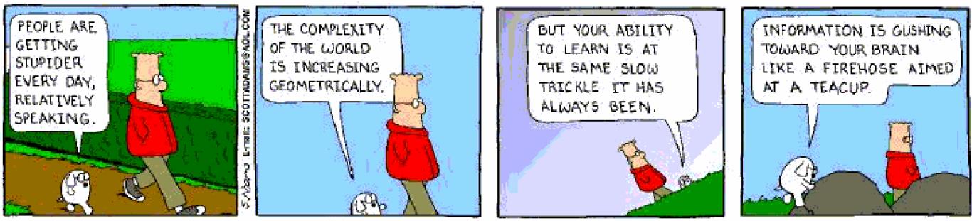
# Storyboards
# Why
We've collected data from real users and from competitive products
我们已经从真实用户和竞争产品中收集了数据We've determined the Mental Models our users have by developing Personas
我们通过开发 Personas 来确定用户拥有的心理模型We have a good idea of the Scenarios of use that our users will attempt
我们对用户会尝试的使用场景有很好的了解It's pretty tempting to go find a computer and start building something!
很容易找到计算机并开始构建东西!We stop thinking conceptually and start thinking pragmatically
我们停止从概念上思考,开始进行务实思考We focus on the software tool's constraints instead of the problem's constraints
我们专注于软件工具的约束,而不是问题的约束We pay attention to painstaking details (colors, font sizes, pixels) instead of overarching concepts (users, goals, needs)
我们注重细节(颜色,字体大小,像素),而不是总体概念(用户,目标,需求)
# Storyboard overview
Borrowed from the film/animation/comic industries
从电影 / 动画 / 漫画行业借来的- One panel = One Scene
一个面板 = 一个场景 - Presented to a group of people
介绍给一群人 - Gauge their reactions, understanding
衡量他们的反应,理解 - Takes time up front, saves time later
提前安排时间,以后节省时间
- One panel = One Scene
Intended to visualize our scenarios
旨在可视化我们的方案Provide a mechanism to gracefully move from conceptual design to screen design
提供从概念设计到屏幕设计的优雅过渡机制Allow us to make mistakes early, in paper (cheap and quick), instead of later, in software (expensive and tedious)
让我们尽早在纸上(便宜又快速)犯错误,而不是以后在软件上(昂贵而乏味)犯错误。Getting feedback from the users early in the process
在此过程的早期就获得用户的反馈- In initial tests to gauge user reaction
在初步测试中评估用户反应 - In study of customers to match with their ideas
研究客户以符合他们的想法 - To rapidly design interfaces from interaction with potential users
通过与潜在用户的互动来快速设计界面 - To clearly articulate an idea with clients or management
与客户或管理层明确表达一个想法
- In initial tests to gauge user reaction
Help with the design process
帮助设计过程- The individual steps of a design are made clear by this process
通过此过程可以明确设计的各个步骤 - Complex interactions can be broken into multiple screens if the complexity is displayed by the storyboard process
如果情节提要过程显示复杂性,则可以将复杂的交互分为多个屏幕
- The individual steps of a design are made clear by this process
# Storyboarding
分镜头脚本设计


- Storyboard drawings do not need to be perfect.
情节提要板图纸不一定是完美的。 - The purpose of a storyboard is to get an idea across to a potential user.
故事板的目的是将想法传达给潜在用户。 - In fact, if the drawings are of poor quality –it is better for the use of explaining an activity.
实际上,如果图纸质量较差–最好用于解释活动。 - Perfectly finished drawings distract the observer to the color, accuracy etc. of the drawing rather than the interaction process.
完美完成的工程图,使观察者分散到工程图的颜色、准确性等方面,而不是交互过程。

# Information Visualization
Data Explosion
- Society is getting more and more complex
- There is just simply more stuff
- Computers, internet and web give people access to an incredible amount of data
- news, sports, financial, purchases, etc.
- We are in an age where we have become dependent on data. Some call it the age of big data.
Data Overload
- Confound: How to make use of the data
- How do we make sense of the data
- How do we harness data in decision making processes
- How do we avoid being overwhelmed
![]()

Human Vision
- Highest Bandwidth Sense
- Fast, Parallel
- Pattern Recognition
- Pre-attentive
- Extends memory and cognitive capacity
- People think visually
- Our challenge is to transform data into information –preferably visual
# Why
Because of the way the human brain processes information, using charts or graphs to visualize large amounts of complex data is easier than poring over spreadsheets or reports.
由于人脑处理信息的方式,使用图表或图形来可视化大量复杂数据要比遍历电子表格或报告容易。
Data visualization is a quick, easy way to convey concepts in a universal manner –and you can experiment with different scenarios by making slight adjustments.
数据可视化是一种快速,轻松地以通用方式传达概念的方法 - 您可以通过稍作调整来尝试不同的方案。
A visualization is a form of external cognition. Just like writing down a column of numbers helps you add them, drawing a picture of data in the right way helps you see patterns and relationships that would otherwise be invisible. Your perceptual system contributes to the thinking process when your data is visualized.
可视化是外部认知的一种形式。 就像写下一列数字可以帮助您添加数字一样,以正确的方式绘制数据图也可以帮助您查看原本不可见的模式和关系。 当您的数据可视化时,您的感知系统有助于思考过程。
# What
- Often thought of as a process for making graphic or image
通常被认为是制作图形或图像的过程 - Really it is a cognitive process
确实是一个认知过程- Form a mental image of something
形成事物的心理形象 - Internalize an understanding
内化理解
- Form a mental image of something
- The purpose of visualization is insight not pictures
可视化的目的是洞察力而不是图片- Insight: decision making, discovery, explanation
洞察力:决策,发现,解释
- Insight: decision making, discovery, explanation
# How
- Motivation
动机- Why we visualize, historical examples
为什么我们想像历史例子
- Why we visualize, historical examples
- Using space well
善用空间- Scatter plots, tree maps, tag clouds
散点图,树图,标签云
- Scatter plots, tree maps, tag clouds
- Interactivity
交互性- Overview, zoom and filter, details on demand
概述,缩放和过滤,按需提供详细信息
- Overview, zoom and filter, details on demand
- Toolkits for visualization
可视化工具包
# Main Idea
Visuals help us think
视觉帮助我们思考- Provide a frame of reference, a temporary storage area
提供一个参考系,一个临时存储区 - Seeing is believing
眼见为实 - A picture is worth a thousand words
一张图片值一千字
- Provide a frame of reference, a temporary storage area
External cognition aid
外部认知辅助- Role of external world in thinking and reason
外部世界在思想和理性中的作用 - An illustrative example
示例
- Role of external world in thinking and reason
Information visualization
信息可视化- Items, entities, things which do not have a direct physical correspondence
没有直接物理对应关系的项目,实体,事物 - Notion of abstractness of entities is important
实体的抽象性概念很重要 - Examples: baseball statistics, stock trends, political data etc.
例如:棒球统计,股票趋势,政治数据等。
- Items, entities, things which do not have a direct physical correspondence
Analyze
分析- Think with your perceptual system
思考您的感知系统 - Play with the data to understand it
玩数据以了解它
- Think with your perceptual system
Present
现在- Convey information to others
向他人传达信息 - Collaborate
合作 - Highlight important facts
突出重要事实 - Make a decision
作出决定
- Convey information to others
# Examples
# Challenger Explosion
The cause of the explosion was a breached O-ring in one of its rocket boosters. The O-ring failed because temperatures were well below freezing when the shuttle launched, and the material of the O-ring wasn't resilient enough to maintain the seal.
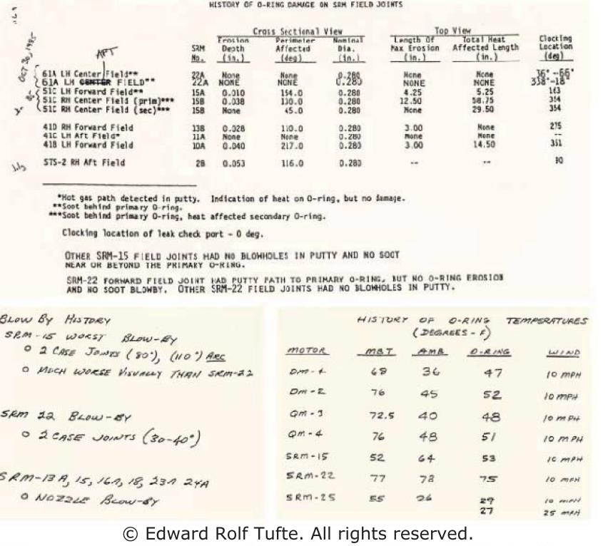
Some of the information used in the decision was presented this way. Tables are a form of visualization, but a weak one. They don't exploit all the capabilities of our visual systems to perceive and to think; they don't exploit all the dimensions of our visual systems.
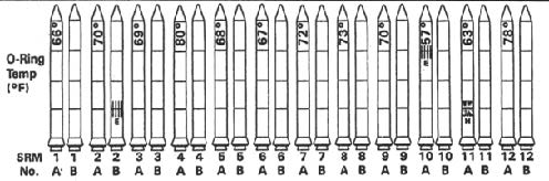
Here's another way to present it (a reproduction of a visualization that was actually used in the decision-making process before the Challenger launch). Each pair of rockets represents an actual pair of rockets (A and B) launched on a prior shuttle mission (SRM, numbered 1 to 24).
The launches are ordered by air temperature at launch (written sideways on the top of the rocket).
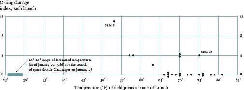
Here is Edward Tufte'sredesign of the visualization, showing the same data. First, it dramatically simplifies the display, doing away with the rocket pictures in favor of much stronger visibility of the essential information (temperature and O-ring damage). Second, it changes the x-position from merely showing the ordering of the temperature variable, and instead uses it to show temperature in a quantitative way. These changes have a dramatic effect on the story told by the display, especially when we add the additional piece of information that the current temperature (when the decision makers were considering the launch) was well below freezing –far to the left on the graph.
# Summary
A good infovizprovides three things
一个好的信息提供了三件事- Overview
概述 - Zoom and Filter
缩放和滤镜 - Details on demand
按需详情 - In a graphical user interface, the user can interact with and change the visualization with the above criteria
在图形用户界面中,用户可以按照上述条件与可视化进行交互并更改可视化
- Overview
Provide an overview that lets the user see all the data, get a big picture view of what's where, and see important relationships at a glance
提供概述,使用户可以查看所有数据,大范围查看概况,并一目了然地查看重要关系Provide the ability to zoom and filter the visualization, so that the user can reduce the (probably overwhelming) overview down to a subset of the data that they want to study more carefully
提供缩放和过滤可视化效果的功能,以便用户可以将(可能是压倒性的)概览缩小到他们想要更仔细研究的数据子集Provide more details on demand. Hovering over a point displays its title. Clicking on a point brings up a more detailed, probably more textual representation of a data item
按需提供更多详细信息。 将鼠标悬停在一个点上会显示其标题。 单击某个点将显示数据项的更详细,可能更多的文本表示形式
# Internationalization and Localization
# Why
Note: These are in addition to all the previous recommendations / guidelines
注意:这些是以前所有建议 / 准则的补充
- Used in more than one country
在多个国家使用 - Not just language translation
不仅仅是语言翻译 - English versions of products may be used all over the world
产品的英文版本可能在世界范围内使用 - Reviews of products may mention international usability issues
产品评论可能会提及国际可用性问题 - All web sites are globally accessible
所有网站均可全球访问 - Providing multiple language versions
提供多种语言版本 - Making the English version more accessible
使英语版本更易于使用
# What
- Internationalization 国际化
- One design that can be used world-wide
一种可以在世界范围内使用的设计 - Localization 本地化
- Different designs customized to different languages
针对不同语言定制的不同设计
Essentially, internationalization separates the language-specific parts of the interface from the rest of the code, so that those parts can be easily replaced
本质上,国际化将接口的语言特定部分与其余代码分开,以便可以轻松替换这些部分
The process of making a user interface ready for translation is called internationalization
使用户界面准备好进行翻译的过程称为 internationalization 国际化
Actually doing this translation for a particular language and culture is called localization.
实际上,针对特定语言和文化的翻译称为 localization 本地化。
# How
Not just translating the interface
不只是翻译界面- Web sites may have different content
网站可能具有不同的内容- e.g. German yahoo has "Sports" on front tab, compared to US Yahoo "Finance"
与美国雅虎" 财务 "相比,德国雅虎的前置标签为" 体育 " - And different icons for sports:
以及不同的运动图标:
- e.g. German yahoo has "Sports" on front tab, compared to US Yahoo "Finance"
- Different sizes of language may require redesign
语言的不同大小可能需要重新设计- But automatic layout can help
但是自动布局可以帮助
- But automatic layout can help
- Web sites may have different content
Indicate content that is not translated www.kit.edu
指示未翻译的内容When there is a choice of language
有语言选择时- Don't use flags to indicate language: http://www.russell-newton.it/
不要使用标记来表示语言- US vs. Canada vs. England
美国 vs. 加拿大 vs. 英国
- US vs. Canada vs. England
- Use language's own name for itself (ENGLISH, ESPAÑOL)
自行使用语言的名称 - Good place for pictures of text (if fonts aren't loaded)
文本图片的好地方(如果未加载字体)
- Don't use flags to indicate language: http://www.russell-newton.it/
First page in default language, so, many won't need extra click
首页使用默认语言,因此,许多页面不需要额外的点击- Make links for other languages easy to find (e.g., www.knto.or.kr/)
使其他语言的链接易于查找 - Not: http://thai.tourismthailand.org/home
- Make links for other languages easy to find (e.g., www.knto.or.kr/)
# Translation
Every piece of text that might be shown to the user is a potential candidate for translation, like menu items and button labels and also text drawn with stroke drawing calls, and text embedded in pixel images
可能会向用户显示的每条文本都是潜在的翻译候选对象,例如菜单项和按钮标签,以及通过描边绘制调用绘制的文本,以及嵌入像素图像中的文本
Translation can easily change the size or aspect ratio of the text; German labels tend to be much longer than English ones, for example
翻译可以轻松更改文本的大小或长宽比; 例如,德国标签往往比英语标签长
Error messages also need to be translated, of course –which is another reason not to expose internal system names in error messages
当然,错误消息也需要翻译 - 这是另一个不在错误消息中公开内部系统名称的原因